I think I’m proposing a similar system, just using the context menu rather than the mode system. But a mode where you can add ghost annotations could be fun.
1 Like
If it were a separate mode it wouldn’t take up space in the context menu and only come up when you need it. Does that make sense as a design choice?
2 Likes
The always coming up was why I was thinking ti should be limited to 256 characters. But the context menu already exists and augmenting it might be less hassle to program. But a whole other mode might be fun to play with.
1 Like
Yeah if we think about if as three separate modes - building, documentation, and performance (lock mode) it makes some sense to wall them off from one another a little.
1 Like
Well, IMO, if it’s labelled there’s no need for tooltips. Without labels modules are often obscure for me. Even my own filters that have later been formated for the library, I had to look inside to understand what the knobs were doing.
I just had a quick look at images of your beloved eurorack modules, and they almost all have labels. That just makes sense to me. I personnally almost always work with labels and larger « modules », and I’m iPad only.
Truth is, would be cool to have more text editing possibilities (size, fonts).
2 Likes
Even with eurorack people buy new face plates for popular modules just so they can get rid of the artsy diagrams and replace them with plain English.
Minimalism is different than pragmatic in the context of clarity. The original @sansnom moog low pass had two knobs and they were very clearly labeled.
1 Like
I totally get this, but two counterpoints: even clearly labeled stuff still needs a manual. You wouldn’t be able to tease out exactly what Maths does just because it has a Greyscale alt panel.
Other point: Eurorack and hardware in general has space between knobs built in as a necessity. But iOS contends with a different problem which is screen realestate.
You could have a tooltip for each knob and one for the module itself - the module one could give an overview and the knobs say exactly what each knob does.
Yes I’d love this too - resizeable knobs and buttons would help too. Small vs big knob is a nice way to give a heirarchy to the design. Filter cutoff = big knob, but overdrive probably small knob since its usually a set and forget thing.
1 Like
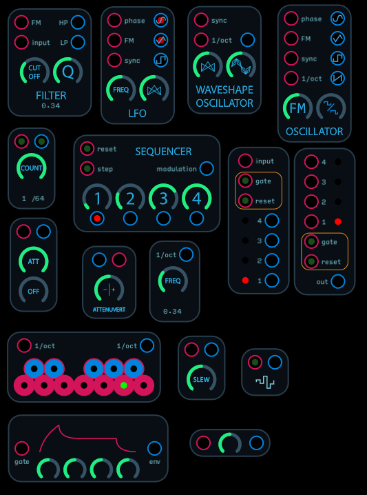
Let me make a “Foundation” series of maybe a dozen modules to make my case that you don’t lose much in the way of screen space to gain a lot of clarity.
1 Like
edit: removed the download as I discovered some bugs. I will refine and re upload in a separate post.
I think these modules could be for people starting out. I kind of have to rush through them because I have other matters to attend to, but they show what I think is a good ratio of size to clarity.
6 Likes
It would be useful to have options for tool tips that come up for individual controls, for modules, and the patch as a whole.
Advantages
- Help Mode is hidden until you need it.
- Select which items you need help with.
- Module level and control level available without having to open up the patch or sub patch.
- Novice users less likely to mess up patches because they don’t have to open up sub patches to learn about how to use the patch.
- Help is an optional part of documenting patches.
- Can minimize text in the GUI because the user can supplement it with tool tips in help mode.
- Demo patches can be created which can used as templates for users to learn how to document their patches.
- Users can use demo patches to familiarize themselves with how specific icons are used so they can more easily figure out other patches despite minimal help documentation by the patch author.
2 Likes
I think you make a good point. If you’re concerned designing about a good GUI, explore all parts of the design elements: Color, size, shape. Understood together, they can all help you learn functions and relationships and prioritize your workflow.
1 Like
From my perspective as a total noob, screen real estate is the least of my concerns. I would find labels on everything far more useful than even tool tips. Then I can see what is going on. If I then understood it I could strip it down to my own specification.
4 Likes
Streamlining a clearly labeled module is like a perfect stepping stone to building a module from scratch.
2 Likes
+1 for labels - I need to often open modules to find out what stuff is. That’s worse than using up real estate (in a scroll-y zoomable space) IMO 
2 Likes
I think a way to improve is through the expressiveness of the control themselves. For example, be able to rotate patches (you can just provide two alternate positions for elements). Or different types of knobs. When I used Audulus most, I really wished I wouldn’t have to always use round knobs and wish I could have horizontal slides. If you look at most synths in the ipad, the organization of the patches many times have TABS or SCREENS. I know in Audulus you have continuous surface, but usually, when just using the patch, you want to focus on functionality. And many times, how you learn about it is through a video, a review. So being able to record a session and export a video (without needing to use any computer) would be a great way to document patches from more of functional perspective. Also, the tooltips have the drawback that since they are hidden, you may not know which ones may be useful, updated, etc. Tooltips reminds me on my toddler toy drawers…the last thing I want to do i open them, and they never whave what I though I needed. Maybe a “scripted” overlay could work better. You finish a patch, and have ordered text (1, 2, 3) and you have a mode where it partially obscures except what is being adressed. This could crete wuick intros, just like some websites and apps do when you first load an app.
But of all, I think the point of not just compactness, but about layout and manual function while using it, and why not aesthetic. If Audulus patches could be made to look better for using (for designing it doesn’t matter at all), have more expressive controls (sliders vertical and horizontal; marked knobs for eg. you could select max positions and it would cycle in 25% increments, etc), font/size choices, tabs (a simple transition from one screen view to another and back), etc. then the patches could be much more intuitive.
I think if you look at the most used and loved synths you will see several kids of controls that would make the instruments/synths more usable. Also, having a way to have dynamic tabs could make things really more compact, and the help could be better organized.
One thing that would make Audulus more mainstream is to have patches that no only sounds great, but look great and are intuitive even to those that aren’t so experienced with Audulus. Or maybe all this I mention should not be in Audulus directly, but a midi companion that can just implement an interface using midi - however, right now, is not practical and scalable.
Also, many times while reding patches, a lot of the clarity comes from how the patch is designed, layed out and explained. And a tooltip would not have helped me much. You get used to reading the circuit pretty fast, but many times the WHY is not just on the control, but in a series of chained ones.
But - I know, there are ideas, and programing anything is a whole different thing than posting ideas in a thread. I know the hard part lies beyond these letters and a good prioritization of what to focus on is the key. In brief, I’d have liked to have freedom to layout patches as I think they should be used, and with more control of the user experience while using them. I think Audulus doesn’t need to imitate others or be what it’s not, but I also think the “end product” does not stand out due to control limitations, a flow limitation (eg. the tabs idea or others that are extensively used).
2 Likes
I tend to agree that often the synthesis of a patch occurs in the gestalt, so understanding some component doesn’t necessarily help with understanding it’s integration. I’m at a bit of a loss about how one could remedy this though without trying to impose some unnecessary orthodoxy. One of my favorite things about Audulus is seeing how different people implement solutions to various techniques and often the differential analysis is what helps me come to a deeper understanding.
Still I enthusiastically agree that sliders and variably sized knobs would be a great help in guiding an intuitive understanding of an interface.
I do not want to be too critical but this software is also not super cheap so I have expectations. I actually have Audulus 3 on my iPad but really want to know what is coming up because as of now it seems a little too limited. I am now going through the free Max MSP course by Stanford U on Kadenze and realise how far behind in functionality Audulus is to Max (sure this is to be expected). By at least by 5 releases. Sure Max is 4 times more expensive but has at least 15 times more functionality (over 600 built in objects and an incredible builtin help system), not to mention community contributions over the years. The most important feature for me is writing my own JS or C extensions. Which I think Audulus needs to think about.
1 Like
To be fair, Max has been in development since the 1980s. It’s also currently developed by a team of people, now with Ableton money behind it. Audulus is a smaller company (only 2 full time people with some outside contractor help here and there), and has only been around since about 2015.
The other thing is Max doesn’t exist on iOS and probably never will - so as far as what you can do on iOS, Audulus is still the most advanced synthesizer programming language of its kind.
Javascript and C would be difficult to implement inside of Audulus because of the way iOS is sandboxed - basically part of Apple making iOS devices as virus-free as possible.
Finally, Max is 20 times as expensive as Audulus (and yet only 15 times the functionality! ![]() ).
).
There’s a lot in the works for Audulus 4 that I think you’ll really enjoy, but as for Audulus 3 - if you’d like to recommend features or ask for specific modules, you can add them to this ongoing thread here:
https://discourse.audulus.com/t/feature-request-megathread/82
2 Likes
For curiosity’s sake, I checked and the current retail price for Audulus on the Mac is $49.99 and Max is $399, so by my calculations that makes Max 8 times more expensive. Given the difference in price, it’s not surprising that Max offers more functionality. As @biminiroad points out, Audulus is available on iOS which brings some constraints on functionality compared to software running on a Mac/PC. An external API is one of the features that’s not really possible in an iOS environment. Apple requires that any executable code installed on an iOS device be signed by the developer with an Apple provided certificate and the only approved installation mechanism for executable code is via the App Store. While not as restrictive as iOS, software marketed via the Mac app store is also subject to certain constraints. As a programmer, I would love to have the ability to extend Audulus, but I don’t see any practical way to implement this within the iOS or Mac environment. While I would agree that Max offers features not available in Audulus, I would argue that Audulus still represents better value for the price.
4 Likes