I’m thinking ahead to Audulus 4 and what the module library should look like for it.
A lot of complaints we get are about how it’s hard to tell what controls and inputs do.
We had the idea (inspired by @paulinko’s helpful comments in another thread) to create a help mode where you can invoke tooltips that explain what each knob and input/output does.
Nevertheless, I’d like to know if people would like more explicit labeling, like pictured below.
The advantage of the way the modules are now (thin and tall) is that you can fit more of them side by side on a screen at once.
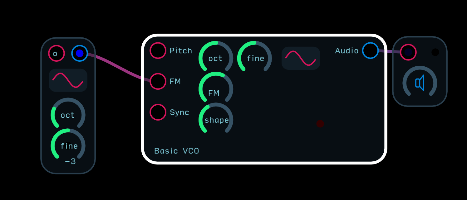
The main signal flow from clock to sequencer to pitch to audio to output flows across the top edge of the patch and modulation goes roughly below each module.
I think this is still a good way to go, but I’d like to hear everyone’s thoughts.
This would apply to the main module library only, which will be a more pared back group of essentials. The weirder more esoteric modules would be found in individual library collections by user - so, for example, I’d put something like the 3D 8 Step Sequencer in my personal biminiroad collection and reserve the sequencer folder in the main library for fewer and more focused traditional sequencers.
I will say that the current UI aesthetic, while cool, makes some of the modules much more opaque… something like a product by Ciat Lonbarde… full of expressive potential, but sometimes you just want a VCO.
This doesn’t seem to be the case for the simpler ones, like the tape delay. Or, I should say, if you already know what a tape delay should feature, it’s not a problem. However, if you’re just getting into synthesis it could be a problem.
When I open Audulus I often find myself rebuilding things from the basic nodes since I already know them. Feels inefficient, but I don’t use Audulus enough to get over the learning curve.
I totally get that. But you think tooltips would solve this? The idea is we’d have standardized icons that mean only one thing (like octave shift or fine tune control) and then when you want to know specifically what an input, output, button, or knob does, you enter a help mode and just tap on the knob and a text box comes up describing what it is.
Of course since I designed the modules I know exactly what everything does and when I look at a patch I can “see” everything in a way that newbies can’t. After a while, if you have everything explicitly labelled, it might make everything look more busy than it needs to be - hence the hidden but easily accessible tooltips.
So given that that will happen eventually, does that change your mind about how the current library looks as a template for going forward?
Yes, I think so. Having easy-to-access tooltips fixes everything. The words become clutter over time, particularly when using it in Eurorack-esque mode.
If we have popups for help, I would rather have the graphics, particularly if they are standardized (at least for the most common ones). I prefer the look, and the I/O labels take up a lot of room. Screen space is at a premium especially on the iPad, so anything that makes a module more compact without losing function is a plus.
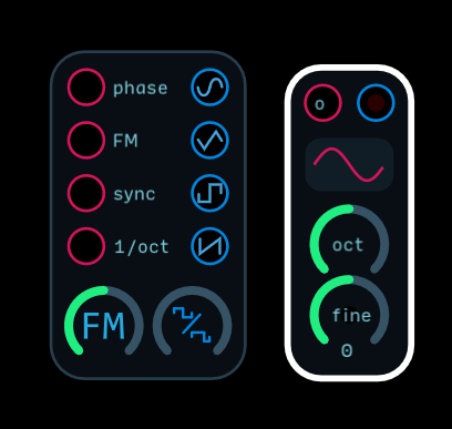
Lol, i feel like this is one of those push polls. The oscillator on the right has so much space in it. I suspect @biminiroad is trolling me
Honestly, I wish the basic VCO has separate waveform outs, like a Dixie II+ but other than that the basic VCO, step sequencers, clocks, filters, and LFOs modules are great. Maybe those should be the focus for further polishing.
Also clearly labeling something with words is never bad. Just it never is. Either inside or out. You ignore it once you know it, but until then it’s cryptic. I am guilty of this all the time. If you want a good balance take a look at the Intellijel range of products. There’s a great balance of utility with multiple interface elements like switches and different sized knobs.
The basic collection could also make more liberal use of SVGs to make different sizes of text when labeling with the text node is inconvenient, or results in text being awkwardly off center. Since these will be everywhere, it would be nice for them to have a little extra sheen.
Except when screen real estate is a priority, no? I like the multiple outputs you have there but also it doesn’t take advantage of the touch ability to quickly change oscillators. Then I think “Why not put 4 oscillators in there and morph between them with a knob?” but then that adds more CPU…maybe we can just update oscillator node for 4 with more functions. But that’s just for this one.
The problem with tooltips is that they’re great but also breaks immersion somewhat. Labeling things with icons is great but there will be some that will be obscure to someone no matter how well designed.
It’s such a balancing act and that’s why I’m throwing it out to you people so we can get some good discussion going. Everyone’s making good points. Good thing we have until early next year or so to figure this out
LOL! That’s why he put that lone dark red light in the middle of that empty space…just to mess with you.
@biminiroad I enjoy the aesthetics of the more streamlined, non-labeled modules that is the current focus of the design. Explanations of the knobs can always be provided in the internal documentation of a module.
Yes! And we’ll get there with v3, but for v4, the knobs will have little pop up boxes that will have info about what they do. It will be a user editable feature so you could make your own module with pop up text explaining what a knob does.
For a foundational set of modules you need clarity as much as economy. It’s not the job of a basic module to be the most streamlined per se, that would be a node.
That’s you designing. Having multiple, in phase, waveforms to blend between and send different places is a basic way to use a modular oscillato. That’s how I learned in college, that’s how it is on every oscillator I own except braids, and when MI remade braids into plaits, he added a second waveform output.
Is it? I didn’t use lights of the outputs. With nothing plugged into it, Audulus isn’t using CPU on those functions, I don’t think.
I think maybe make a choice between being minimal and being foundational. Make two sets maybe?
When I think tool tip, I think of hovering my mouse over something and a little one word or one sentence description pops up. That wouldn’t work so well on iOS. So how does a tool tip work there?
It’s a help mode you invoke with an icon and then whatever you click on brings up a little dialogue box. It will be user editable so people could add their own tool tips to their modules.
So I was thinking the context menu could have a space at the bottom where you could put that info. You could tap on the know the way you set it’s value and instead of a “rename knob” you could “add description.”
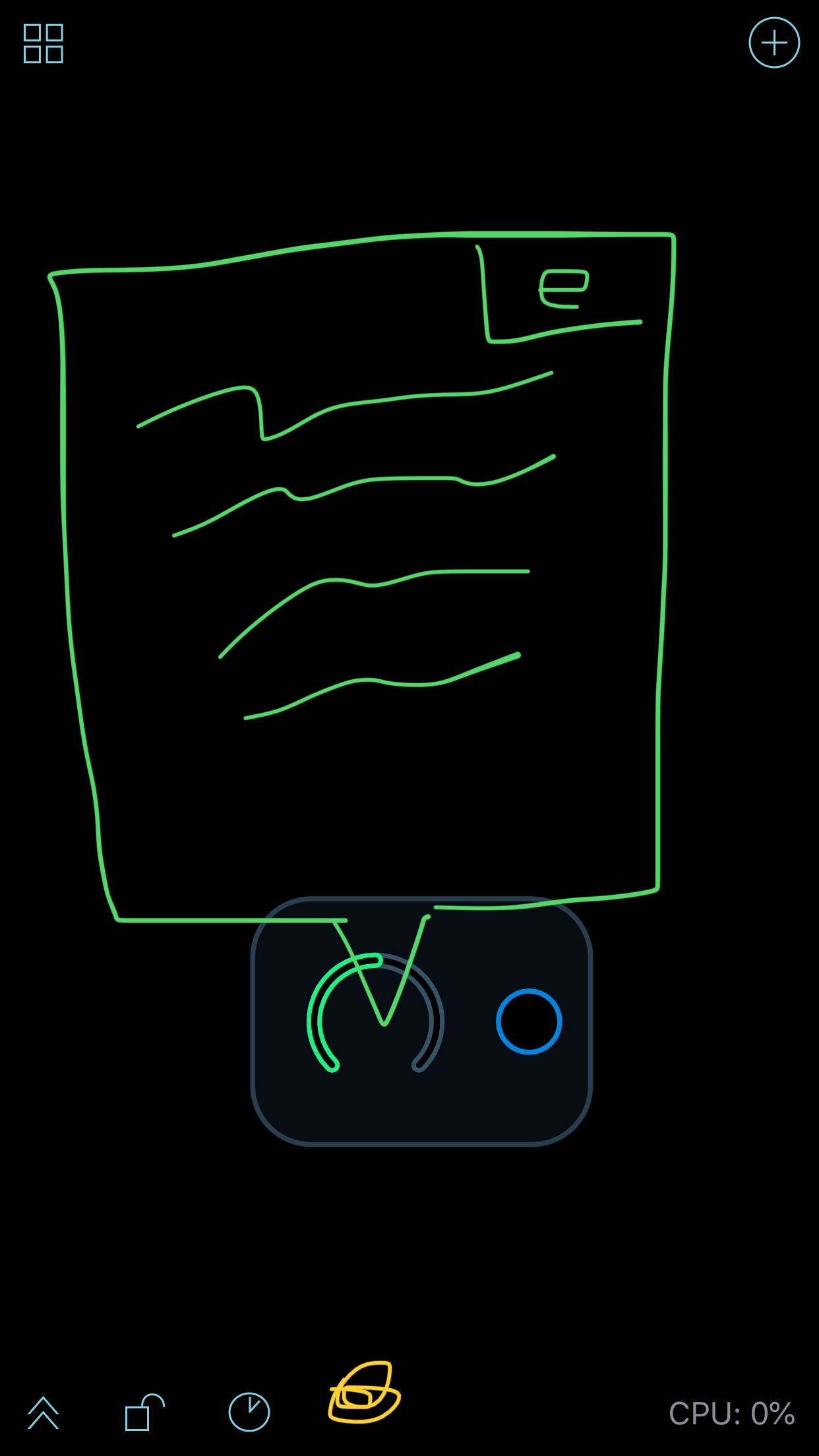
The way I envison it is you invoke help mode and tap on the element and a blank box comes up - you then press edit in the box and type up what you want. Would an illustration help?
So the yellow dot at the bottom would be help mode, you tap on the knob and this box comes up, you tap edit (e) in the corner and keyboard comes up and you write a description of what the knob does.
